
You’ve worked hard to build your brand identity. Now it’s time to get it out into the world. But how do you keep your visual identity consistent between internal departments, outside agencies, and partnering businesses? A brand guide can do a lot of the heavy lifting and answer important questions for people working with your brand.
1. Logo Standards
Your company’s logo is likely the most recognizable part of your brand. Maintaining your logo’s consistency is incredibly important. Maybe you have multiple logo variations, like horizontal and stacked options, or simply just a logo mark without the word mark. All of these variations need to have guidelines so they are not used incorrectly.
It’s important to consider using proper clearspace, or the space that lives around the logo so that other elements don’t crowd it. A ratio-based clearspace allows the space around the logo to remain proportional from business cards to billboards.

Some other things to consider when establishing logo use guidelines are:
- Minimum size allowances
- Correct usage on different backgrounds (a solid color, a busy pattern, or on top of an image or video)
- Alternate color options
- Print versus digital use
In addition to ways your logo should be used, consider outlining ways that it shouldn't be used:
- Squished proportions
- Incorrect color usage
- Variations of the logo that are not brand approved
- Any other common or foreseeable incorrect logo usage
When providing logos for outside use by agencies, media, and other third-party vendors, include these file types (listed in order of importance):
- Vector: Adobe Illustrator
- Vector: Editable PDF
- Raster: High-resolution transparent PNG
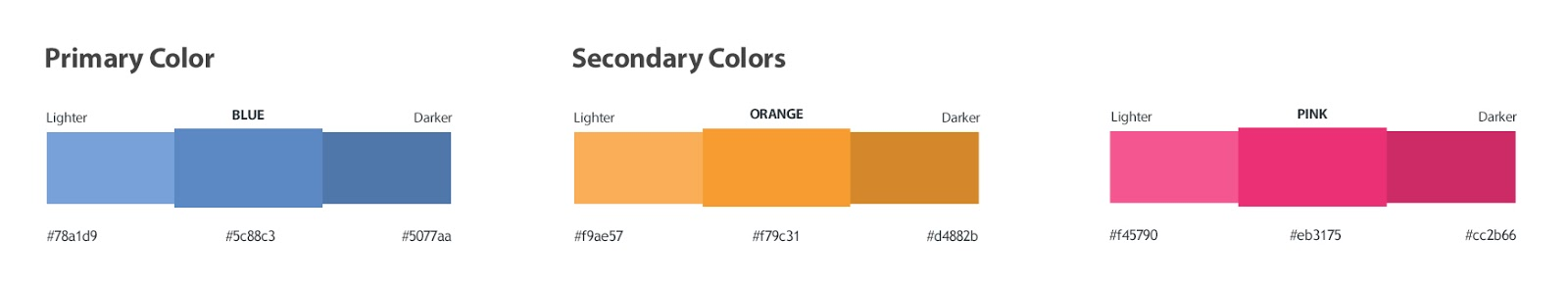
2. Brand Colors
Your color palette should be detailed with hex, RGB, CMYK, and Pantone values as necessary. This ensures that your visual identity is consistent across multiple platforms, from digital to print. Be sure to specify any limitations on when and where certain colors should or should not be used.
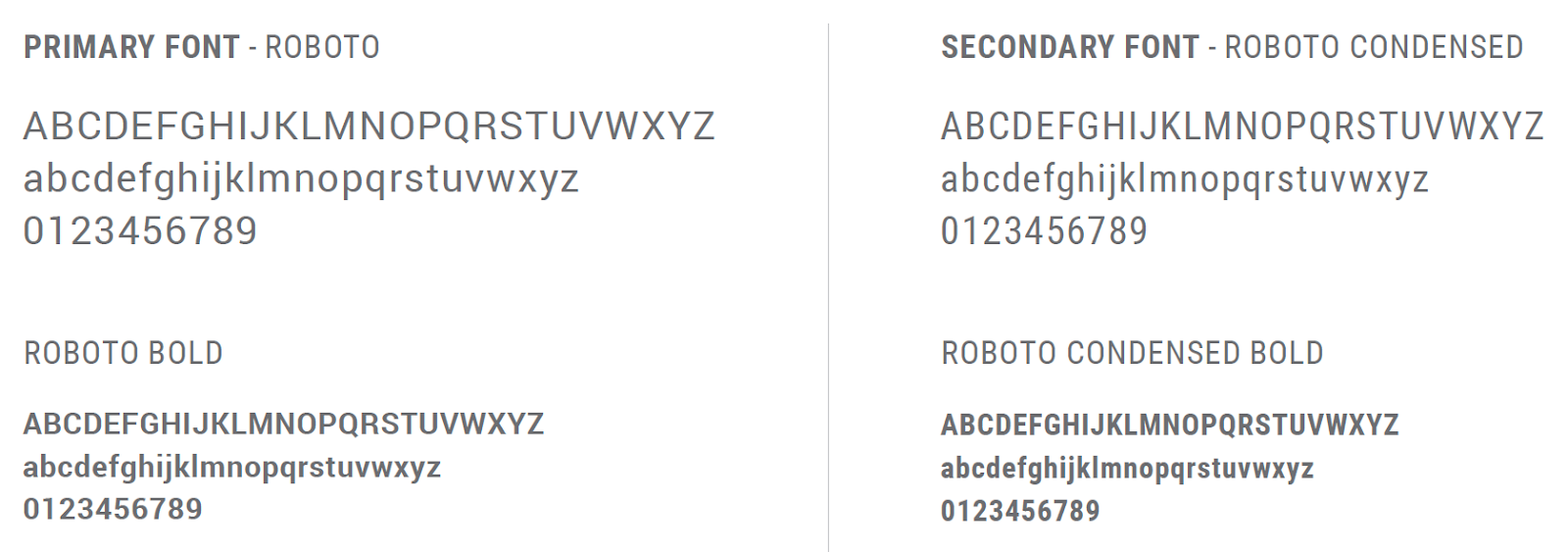
3. Typography
Define your brand fonts. This is as easy as listing your primary and any secondary fonts with a sampling of each. Include any distinctive font usage for large headlines or other specific elements, if your brand uses them often. Consider providing them on your website like this example.
4. Image guidelines
Image use can have a major impact on the message and tone of your brand. Provide examples of appropriate imagery as well as examples of images that don’t meet your brand’s standards. Provide the highest resolution files you have, preferably original downloaded stock photography or raw image files from any custom photography jobs.
When it’s all outlined, provide all logo files, photography, font files, color palettes, and other brand assets in a clearly labeled .zip file.
Since brand guides are put in place to define a brand’s identity, they’ll be as unique from one another as the brands themselves. Some brand guides just cover the basics and can be as short as one page, while others dive deep into the identity and become much more comprehensive. Whatever your strategy for your brand guide may be, you should see a noticeable difference in your brand’s cohesiveness across all platforms after you set clear guidelines. Happy designing!
